


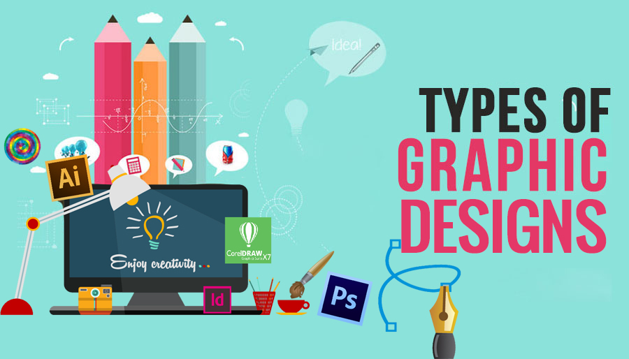


Graphic design is a form of visual communication that is mainly used by businesses and individuals all over the world.
The design can be digital, physical, and more. It seeks to achieve certain objectives using symbols, text and images visually using various tools and elements.
The original forms of graphic design were discovered in cave paintings that were used to keep records, tell stories and provide vital information. Things started to change in the 1920s when art began to be modern through the introduction of new fonts.
Graphic design applications came to the limelight in 1984 when Apple launched its first computer, and these helped designers to come up with awesome designs. Today we look at the different types of graphic design that you will come across.
Post Contents
Corporate Design
When you start a business, you will hear terms such as branding and identity. These are ideal for the uniqueness of the business. Each business has a story to tell its audience, and it uses a variety of visual aspects to do this, so make sure you really focus on how to hire a graphic designer for your company.
Corporate design is all about design and strategy. Design incorporates typography, logos and colors while strategy is all about branding.
Packaging Graphic Design
A long time ago, packaging was all about protecting the product but times have changed and at the moment it can help businesses to increase sales. The design of the package has the capacity to communicate the story of the brand. Long gone are the days when the packaging had no meaning – at the moment it needs to grab the attention of the consumer because of the high competition.
For companies that are manufacturing products, the need for graphic design services to develop the shape, graphics and determine the style of the package is mandatory.
Publication Graphic Design
This is the process of putting together text and images to support the internal content in a visual way. When designing the graphics of a publication, you need to consider where it will be published and the format accepted by the publisher.
Some examples of designs in this category include books, newspapers, newsletters, magazines, annual reports and more.
The designer needs to be sure of what practices and traditions the publisher works for. This is because each publication serves a different purpose, which means a different design is necessary for each of them.
Website Graphic Design

A website has become one of the best digital salesmen for businesses across the world. Each company needs a user-friendly and aesthetically pleasing website to talk about the company and offer a platform for showcasing goods and services.
The job of the designer is to put together elements including images, text and others to make a site that is pleasing and easy to use. Remember the design of the website can add or reduce on the curiosity of the visitor.
Conclusion
These are just a few of the top graphic design types. Others that you can come across include 3D graphic design, environmental graphic design, advertising graphic design and many more.


1 thought on “4 Types of Graphic Design to Know”
Thank you for sharing!
Talking about design, I’m gonna be sharing a designer’s rant; The Wrong File Choice!
To put this into context for those who are not familiar, imagine asking for a glass of wine yet are given a cup with grapes or asking for an item at a department store and simply receiving packaging but no actual product. There is a hidden disgruntlement among professional designers: being given an unusable image file. Inexperienced designers or DIY businesspersons may not know the difference between a “Raster” or a “Vector” image. Nor do many realize there is a vast variance between files ending in “.jpg” or “.png.” Consider this a public service announcement about print vs. web image files and how best to provide art to your designer.
Providing a print designer an image or logo that is embedded into a slide or word document ending with file types such as “.pptx” or “.doc,” you might as well have handed the designer a shovel. That’s about how useful an embedded file is for print production. Print photography and imagery require a minimum of 300 dpi (dots per inch) — at use size for a clean, crisp image.
So what is this raster/vector thing I speak of?
Raster is made of dots: the more dots, the tighter and cleaner the image. Every photo you see in print is made of 4 dots, CMYK = Cyan (blue), Magenta (aka pink), Yellow and black (aka “K”-why “K”, I have no idea!). TIP: Find a magazine and look at it with a magnifying glass. Those four colors make up every photo, color logo, etc., you see in print. The more you increase the size of a raster image, the further the dots move apart. The computer does this handy dandy thing called “interpolation” which is basically the computer guessing what the colors would be between each pair of dots and then fills it in as well as it can, which usually is not very good.
Vector, on the other hand, is mathematically based. It is used for logos and other clean edge items. It is used for linear illustration but is not used for photography. It can be enlarged as big as a billboard or reduced as small as a stamp and never lose quality. Logos for print should be an “.eps” or a “.pdf” (common vector extensions) but can also be raster if they are high enough in their dot count. Extensions of “.pptx” and “.doc” are no more than 72 dpi and thus are absolutely not acceptable for high-resolution printing.
Why?
A file with a dpi of 72 dpi is too small to be clean and crisp in print. If you attempt to enlarge it, it digitizes and looks soft and blurry due to the interpolation. Not good. Most people’s confusing part is that a “.jpg” file can be a low dot count or a high dot count. For internet use, a dpi of a “.jpg” file at 72 dpi or more is fine if used at that size or smaller. (With dpi, reducing the size makes the dots tighter and cleaner, while enlarging causes interpolation.)
On the other hand, an image of 600 dpi is overkill for both print and web. In web use, that large of a file can slow your page load. In print, it just makes your file larger and unwieldy. When the experts speak of optimizing your images online, they mean that images need to be resized to be the smallest they can be and still produce well to not slow page load speed.
The wrong file choice can delay the print or web design process. Ask your agency what file types you own and ask for them to be segregated for your use.
A professional design firm should provide art files in all of the above image types, multiple configurations, and various colors. At NLC, we provide logo files as horizontal, vertical, and in color, black, white, and one other brand color. Then we put vector and 300 dpi raster art in a PRINT folder and lower resolution raster art in a WEB folder. By segregating files, retrieval is easier since potentially needed files are readily at hand. Note that photographers generally provide very large files for imagery. Always better to have too big than too little! But you may want to ask them to provide files in smaller formats as well.
CLIFF NOTES:
Logos should be vector. Images should be 300 dpi and raster. If you are not sure what you have, please let your designer know and send your entire library so they can choose the best resource for you… but for the love of Pete, do not place files into other apps and hope that will work unless you want to spend time seeking other files and send your designer over the edge.