


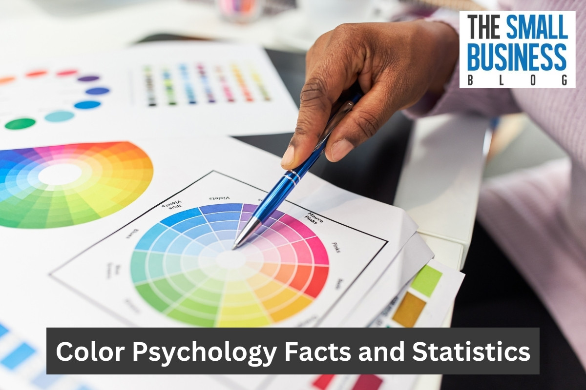


Have you ever seen a home or a room that instantly made you feel calm or happy?
That may have been because of the colors used in and around the home or room.
Colors can often do make a difference.
Whether you’re a marketer or not, these color psychology facts and statistics will be an interesting read.
For marketers, brands, and businesses, colors can impact how a consumer perceives you.
Color psychology is also known to differ according to specific cultures, personal experiences, and personal tastes.
Therefore, choosing your brand, logo, and product packages colors can be a complex process.
The following information has been researched and we found that research to share with our readers in this article.
Let’s find out how colors impact our marketing, advertising, perceptions, emotions, etc.
Post Contents
- 1 Key Statistics
- 2 Color Psychology Facts and Statistics
- 2.1 1. Colors can be used to influence around 90% of first impressions.
- 2.2 2. Between 62% and 90% of consumers make purchasing decisions based on the brand and product color.
- 2.3 3. Black and white images only keep customer attention for two-thirds of a second.
- 2.4 4. 57% of men and 35% of women prefer blue.
- 2.5 5. Blue is the best color for a business website.
- 2.6 6. 93% of shoppers pay more attention to visual appearance when considering a purchase.
- 2.7 7. Two out of three consumers won’t buy a product if it’s not in their favorite color.
- 2.8 8. The color purple denotes quality, royalty, and luxury.
- 2.9 9. Brown and orange are the least preferred colors among men and women.
- 2.10 10. Red is the best color for restaurants.
- 2.11 11. Yellow is an excellent color for industry and for retail display signage.
- 2.12 12. Black is the ideal branding color for art, music, and fashion.
- 2.13 13. Orange is perfect for impulse buying platforms and CTAs.
- 2.14 14. Green is a great color for retail and service-centric businesses.
- 2.15 15. People will read color ads 42% more than black and white ads.
- 2.16 16. 81% of SMB owners feel that their business colors give them an edge over their competitors.
- 2.17 17. A business logo is the first thing a consumer notices.
- 2.18 18. 8% of men and 0.5% of women are color blind.
- 2.19 19. 90% of SMB owners think that colors help customer recall.
- 2.20 20. In Brazil and Thailand, purple is the color of mourning.
- 3 FAQs
- 4 Conclusion
Key Statistics
- Colors can be used to influence around 90% of first impressions.
- Between 62% and 90% of consumers make purchasing decisions based on the brand and product color.
- Black and white images only keep customer attention for two-thirds of a second.
- 57% of men and 35% of women prefer blue.
- Blue is the best color for a business website.
- 93% of shoppers pay more attention to visual appearance when considering a purchase.
- Two out of three consumers won’t buy a product if it’s not in their favorite color.
- The color purple denotes quality, royalty, and luxury.
- Brown and orange are the least preferred colors among men and women.
Color Psychology Facts and Statistics
1. Colors can be used to influence around 90% of first impressions.
Colors have been known to influence consumers’ attitudes and purchasing decisions.
One study revealed that up to 90% of first impressions are based on the colors used for products, promotions, logos, branding, and other elements of a business or product alone.
Other factors to consider include cultural backgrounds, personal experiences and personal preferences.
(MarketSplash)
2. Between 62% and 90% of consumers make purchasing decisions based on the brand and product color.
The color on a brand or product alone influences buying decisions among 62% and 90% of consumers.
According to research from the University of Winnipeg Canada, statistics on color marketing revealed that consumers make buying decisions within 90 seconds of first engagements with products, brands, or people.
(EnterpriseAppsToday)
3. Black and white images only keep customer attention for two-thirds of a second.
It’s wise to know that black and white images are less interesting to consumers than color images.
One study revealed that black and white images keep the attention of consumers for only two-thirds of a second.
However, colored imagery sustains their attention for a full two seconds.
(Instapage)
4. 57% of men and 35% of women prefer blue.
In a survey, people all over the globe chose blue as their favorite color.
In fact, 57% of men and 35% of women all ranked blue as their favorite choice.
Blue is a calming color that evokes trust, wisdom, security, and strength.
It’s also the most used color on logos.
Brands know the power of blue as 33% of their logos have blue in them.
(HubSpot Blog)
5. Blue is the best color for a business website.
When asked what color people want to see the most on business websites, 46% said blue.
Another 30% said green and 22% said red.
These are the three most popularly used on business websites.
Blue and green are the colors that people say they associate with trust and security.
Red is associated with bravery and courage.
(Colorlib)
6. 93% of shoppers pay more attention to visual appearance when considering a purchase.
When considering buying new products, 93% of shoppers focus on its color.
Another 85% claim color is the main reason they buy a product.
We also know that 90% say they make buying decisions based solely on color.
Moreover, research from the University of Loyola discovered that color boosts brand recognition by up to 80%.
(MarketSplash)
7. Two out of three consumers won’t buy a product if it’s not in their favorite color.
If a product doesn’t have something in their favorite color, two out of three consumers say they won’t buy it.
So, color has a significant effect on consumers in today’s world.
If you’re developing a product, this is valuable information to have before you make your marketing plan.
(EnterpriseAppsToday)
8. The color purple denotes quality, royalty, and luxury.
If you look at Cadbury, Hallmark, FedEx, Monster.com, and other brands that use purple in their logos and products, you will understand how people view these businesses as high-quality, luxury, and sophisticated.
Among consumers in one survey, purple was associated with bravery (29%) and feeling happy and fun (17%).
In Biblical times, purple was a color that was associated with royalty and money.
(Instapage)
9. Brown and orange are the least preferred colors among men and women.
According to a survey conducted by Joe Hallock, 23% of people said they didn’t like brown and 30% said they didn’t like orange.
These two colors were chosen as their least favorites in the survey.
Oddly, purple came in third with 13% of people saying it was their least favorite color.
(WebTribunal)
10. Red is the best color for restaurants.
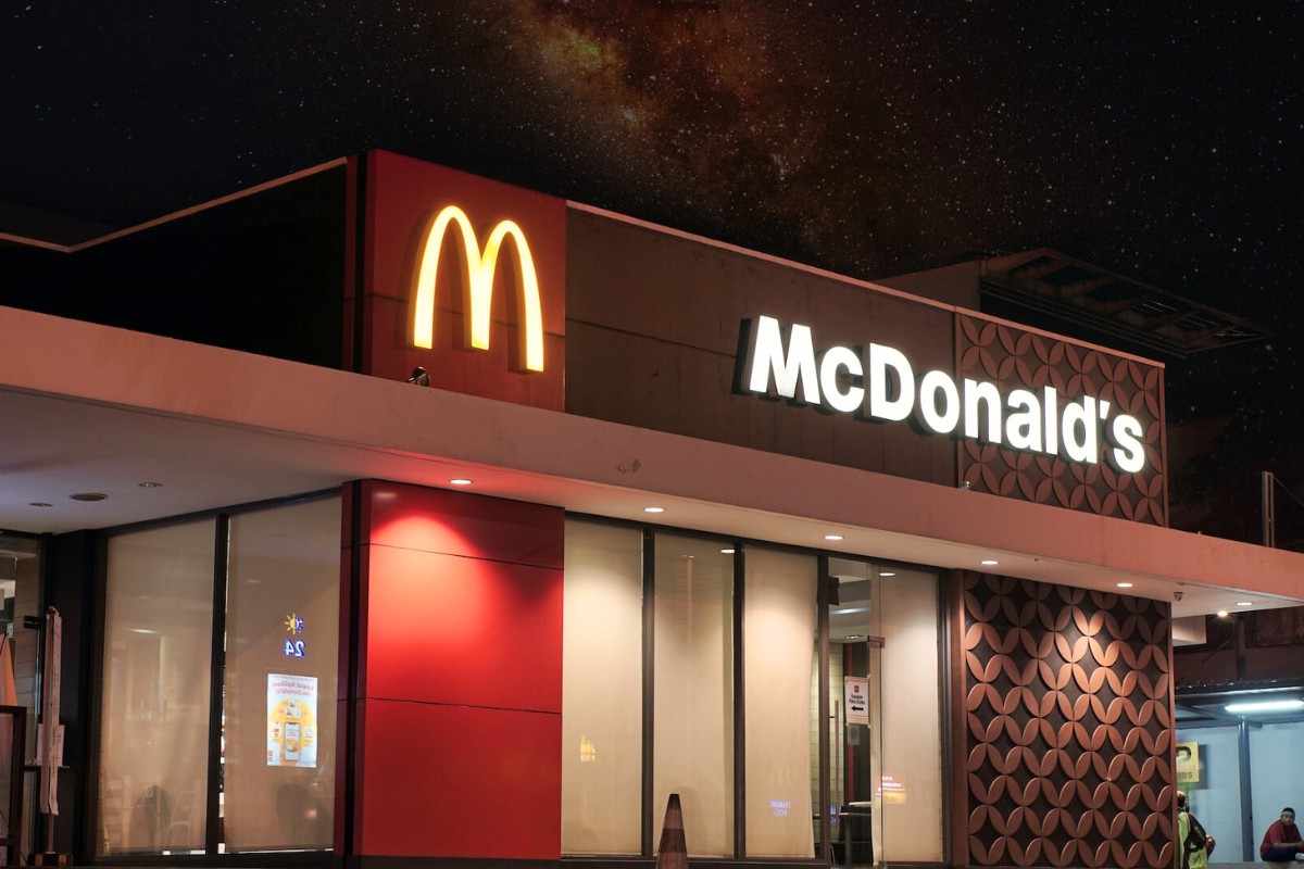
Why would red be the best color for restaurants?
Red reveals a sense of urgency and is associated with appetite.
It’s also the best color for retail businesses to use for clearance items, product liquidations, or sales.
For marketing, red is ideal for CTA (call to action) buttons or shop now buttons.
(MarketSplash)
11. Yellow is an excellent color for industry and for retail display signage.
Yellow is often associated with affordability and positivity.
It’s fun, energetic, happy, playful, cheerful, inviting, and warm.
However, it also represents danger and warnings.
Yellow is the ideal color for industrial purposes, for showing dangerous areas and warnings for certain areas.
However, for retail, it’s perfect for signage and window displays.
(99Designs, MarketSplash)
12. Black is the ideal branding color for art, music, and fashion.
In terms of color, black represents luxury, sophistication, authority, elegance, power, security, formality, and mystery.
It may also denote darkness, control, sexuality, coldness, negativity, mourning, oppression, depression, and heaviness.
Black is used by companies like the New York Times and L’Oreal, and it’s used to sell glossy looking products and exclusives.
(99Designs, EnterpriseAppsToday, MarketSplash)
13. Orange is perfect for impulse buying platforms and CTAs.
Orange is considered the happiest of all colors on the color wheel.
It’s most associated with enthusiasm.
Orange is a high-energy color that also denotes friendliness, humor, vitality, affordability, youth, and seasonal change.
It’s warm and makes people feel comfortable, so it’s perfect for impulse buying platforms and CTAs.
In contrast, it’s not good for corporate business where it would seem too frivolous.
You will find orange in the Nickelodeon logo.
(HubSpot Blog, Instapage, MarketSplash)
14. Green is a great color for retail and service-centric businesses.
Green is associated with environmentally friendly companies and is ideal for that sector.
It denotes nature, peacefulness, and good health.
Green is also associated with calmness, maturity, and professionalism.
It’s great for businesses related to finance, the environment, and health.
It represents the ideas of renewal, balance, harmony, wealth, growth, good luck, and health.
Animal Planet and John Deere both use green in their logos.
(MarketSplash, 99Designs)
15. People will read color ads 42% more than black and white ads.
One study revealed that people will read color ads 42% more than black and white ads for the exact same ad.
Color is influential even to get people to watch ads online or read ads in magazines.
Which would get your attention better?
(MarketSplash, Review42)
16. 81% of SMB owners feel that their business colors give them an edge over their competitors.
In terms of small-to-medium-sized businesses (SMBs), 81% of owners of these businesses believe that the colors they have chosen for their business signs, business cards, logos, and other identifying markers give them an edge over their competition.
If they are using colors the ways we have mentioned in this article, they may be right.
(MarketSplash)
17. A business logo is the first thing a consumer notices.
Your business logo is so important that it’s the first thing consumers and customers notice.
Logos are the face of your business, so using color psychology to choose your colors according to what you know about how colors affect people is important.
You may find this useful for attracting your target audience to your website.
(WebTribunal)
18. 8% of men and 0.5% of women are color blind.
It’s also important to understand that there is a percentage of consumers out there who don’t see color the same way as most others do.
Color vision deficiencies like color blindness impact how they see colors.
However, most of this demographic can see blue.
(Review42)
19. 90% of SMB owners think that colors help customer recall.
A startling 90% of SMB owners believe that colors help customers to remember and recall documentation and presentations.
Since people read color ads more than black and white ads by 42%, it makes sense that color would also contribute to their recall of a product, brand, or business.
(MarketSplash)
20. In Brazil and Thailand, purple is the color of mourning.
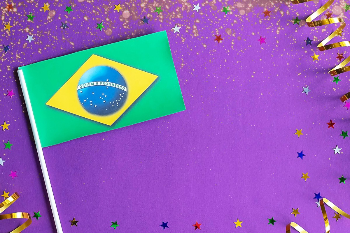
As an example of how culture is impacted by color, color psychology data shows that in Thailand and Brazil, purple is the color of mourning.
In the United States, black is the color of mourning.
Marketers must pay attention to location demographics when they are targeting audiences across the globe.
(WebTribunal)
FAQs
What is Color Psychology?
Idea behind color psychology says that different colors have an impact on human emotions and behaviors.
The basis is that every color has various psychological associations that may affect how we feel, think, and behave.
What are Some Colors and Their Meanings?
The “meanings” of diverse colors reveal their believed associated emotions, behaviors, and thoughts.
However, the effects of colors also depend on other factors such as personal experience and culture.
Here are the basic associations of different colors:
1. Black: Mystery, Sophistication, Power
2. Blue: Sadness, Trust, Calm
3. Brown: Comfort, Earthiness, Stability
4. Green: Peace, Nature, Harmony
5. Orange: Creativity, Excitement, Energy
6. Pink: Romance, Femininity, Love
7. Purple: Wisdom, Luxury, Loyalty
8. Red: Danger, Anger, Love
9. White: Cleanliness, Simplicity, Purity
10. Yellow: Creativity, Optimism, Happiness
How is Color Psychology Used in Marketing?
Color is used to influence consumers in advertising and marketing.
Based on colors and their associations, marketers use color to spark emotions like excitement (oranges), calmness (Blues), and others.
How Does Color Psychology Impact Interior Design?
As you might suspect, color does influence how people have their homes painted and on its overall decor.
For instance, to create a mood or an atmosphere of excitement and energy, one might use yellows to invoke that “feeling” in the kitchen.
Blues are often used to create calmness, which is often used to paint bedrooms or bathrooms.
How Does Color Psychology Affect the Fashion Industry?
Red has long been the standard “power” color in the business world.
Red ties, suits, shirts, and other red apparel and accessories are viewed as power apparel.
If you’ve even heard the term “power tie”, the tie is likely red.
Another example is black which is perceived as mysterious and sophisticated.
For instance, “Black Tie” events are high-society gatherings where attendees have a dress code which includes wearing a black tie with a suit.
You may also have heard that women who wear dresses need their “little black dress” which is something they can wear for just about any event.
Does Color Psychology Affect My Life?
Sure.
You can use color psychology to impact your life.
Here are some ways we found in our research:
1. You can match your colors to your mood or your mood to colors. If you’re feeling calm and collected, blue and white are both excellent colors. Yellow and orange could mean you’re feeling creative or excited about something.
2. The colors you choose for your office or home can help or hinder your productivity. for instance, if blue is associated with calmness, then you’re in control of your emotions, making this a good office color.
3. Utilize color psychology in your marketing efforts to influence consumers in your target audience.
4. Choose colors for your logo and branding that represent who you are and what your company stands for.
Conclusion
Color psychology is a sophisticated and fascinating topic.
However, by understanding the meanings of colors, you can use them to your advantage to make your life better, influence others, or to enjoy some peace at home or at work.
Overall, color psychology is used to market and promote products, services, and brands.
These statistics show us that there is a place, time, and market for colors to be used.
Likewise, where they should not be used.
We hope you have enjoyed reading these color psychology facts and statistics as much as we enjoyed researching and writing about them.
We also hope it gave you some value and is useful to you.