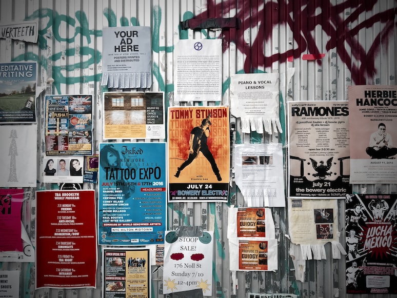
We’ve all designed posters throughout our lives for school, a business event, or a birthday celebration.
When creating a poster, many factors should be taken into account, including the best typeface that would make it legible and the color combination.
Even if you are not a graphic designer, you can always start by searching the internet for free poster templates, reducing your labor and effort in half.
However, you have to avoid these mistakes when designing a poster, even if you work with a template.
Such simple mistakes can drastically harm your company’s brand or turn people off from your event.
Post Contents
Not Having A Clear Message
No matter how creative and engaging the design you want to have, you must never miss the point of clarity.
Each poster should have a single, unambiguous message, and your design should be simple and minimalistic enough to make that message obvious.
You should avoid having too many strong elements that may distract the person reading the poster from the main narrative.
To ensure your message is clearly seen, you can try adding images, graphics, and typography that supports and enhances the message.
By following a simple layout and avoiding cluttering, you can create a unique and effective design.
Lack Of Contrast
To ensure your poster is easy to read and clear enough, it’s important to have a high contrast between the background and the text.
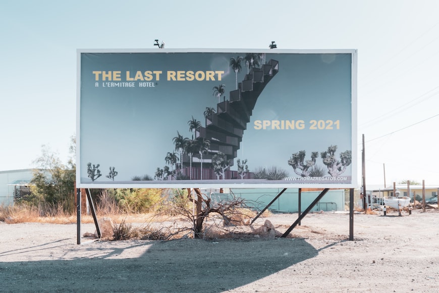
You must avoid using the same colors for the background and the text, as it will make the text difficult to read from the poster.
Choosing opposite colors from the color wheel is the best way to create a poster. The most simple choices would be black and white, black and yellow, or red and green.
By using high contrast, you can ensure that your poster is easy to read and visually appealing.
Poor Typography
Typography is a significant part of your poster, and poor typography makes the content difficult to read.
You should avoid fancy fonts that are difficult to read from afar. Simple fonts should be used, and a single font should be used throughout the poster.
Using different typography in the poster may create a confusing look and will make it look unattractive.
Another important thing to keep in mind is the size of the font. The writing must be big enough to be seen from far away.
But you can figure out what size font to use based on where it will be hung. You can also choose a smaller font if it will be displayed in a classroom or office where people will be looking at it up close.
Poor-Quality Images
Images, logos, and symbols are essential components of every high-quality poster. The poster’s impact may be diminished if it contains photographs of poor quality.
Remember that the quality of an image differs depending on whether it is shown on a computer screen or printed.
If you choose to include an image with a low resolution in your design, it will seem fuzzy in the poster when it is printed.
To prevent this from happening, you may examine your design on different mediums after making your poster and try to print out a copy.
If you use photographs of excellent quality, your poster will appear a lot more polished and sophisticated.
It’s also critical to set the printing resolution of at least 300 dots per inch to ensure that the printout will have great quality.
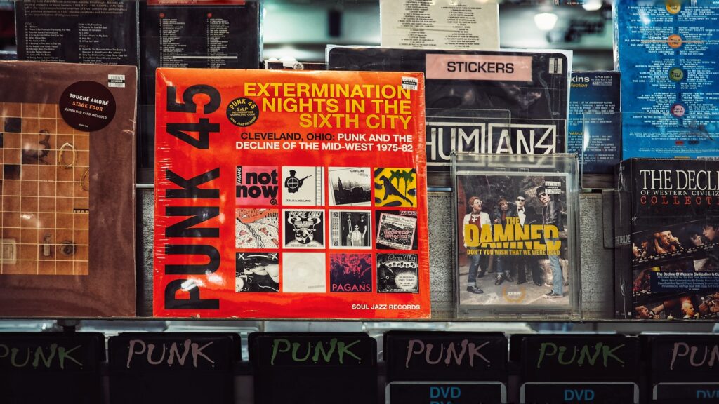
Adding Too Much Text
A large amount of text can also reduce the effectiveness of your poster. You should try to find a balance between text and graphics to ensure the clarity of your design.
Too much text creates clutter and makes it difficult to read. Remember that you should keep the message short and concise, as long ones may lead to confusion among readers.
Too much text makes the design unappealing, too, and the viewer will not engage with it as much.
In addition, having an excessive amount of text on the banner might make it seem unprofessional, which, in turn, decreases the likelihood that the audience will take the message seriously.
Conclusion
Keeping these tips in mind, you now know what mistakes to avoid while creating a poster.
Remember that a good poster should convey your message creatively. By keeping these points in mind, you can make a design that delivers your idea and leaves a lasting impact on the viewer.


